TOO MUCH, TOO SOON?
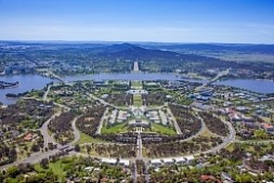
In a design studio I was teaching in 1980, I was not surprised by the skeptical faces of the critics I had invited to my students’ final presentation. I was expecting this, because the assignment I had given them was for a new Parliament House in Canberra, Australia, a huge building with a complex program and a really complicated site that had been occupied by Aboriginal militants so no building would be placed on the hilltop they claimed as sacred. The Parliament had been the subject of an international competition won by a team led by Romaldo Giurgola. The winning design had not yet been made public, but Ric Thorp, a member of the design team, had agreed to give us a preview at the end of the students’ projects’ review. The competition brief had made it clear that the building “must be more than a functional building. It should become a major national symbol.” Wasn’t this too much to ask from my second year students at Columbia University’s graduate architecture program? Was I throwing caution to the wind, as this was my first time teaching there? It was obvious that the critics were doubtful that the difficulty of the assignment would result in acceptable designs. I had taken great care in choreographing the presentations so that the two projects reviewed at the onset, although unimaginative, illustrated the parameters of the problem. The following projects then established the different approaches taken by the students, in a sequence that would lead up to the rewarding finale.
At a coffee break one of my Columbia colleagues chided me for putting the students in such a challenging situation. If they failed, it would be my fault. Yet he admitted that the projects presented thus far were well resolved, if not exactly brilliant. What the critics couldn’t see was the huge amount of work I decided to put in to help the students develop their designs once I realized that what they had learned so far was not enough to enable them to succeed in tackling such a difficult task. I stayed with them well beyond the four hours of studio time three times a week, and most weekends as well.
The final project we reviewed was by Mark Mariscal. It proved that, with proper coaching, a talented beginner could design a project that responded with great assurance and originality to the complexities of site, program, context and symbolic presence. To begin with, Mark had left the top of the hill untouched, so that protestors might occupy it. Two boomerang-like walls connected the building to the geometry of the city, and shielded all administrative functions from the visitors in a lower level, making the chambers of Parliament fully accessible under the hilltop. At this point in the review the critics were enjoying the discussion and praising the students for their commitment and the variety of their proposals. After the review Thorp presented the winning design, so similar to Mark Mariscal’s as to leave everyone speechless. Thus I felt vindicated for taking an approach that went precisely counter to that of Robert Stern, a very influential Columbia colleague, who was demanding that his students select a building from Vignola’s 16th century treatise on the rules of the five Classical orders of architecture, and use it as a historical precedent for their designs, regardless of their site, function or purpose in the late 20th century. Rather, the strenuous experience in my design studio had made me realize the importance of developing a clear and rigorous teaching method that would allow the students to meet the challenge of nuanced design regardless of the size and complexity of a project.

Parliament House, Canberra. From Airviews Online
reply? please send me an e-mail